UI design
Color Psychology: How Colors Affect User Decisions
Colors influence emotion, perception, and conversion. A practical guide to choosing and placing color in interfaces — accessibly.
 Ajmain Fayek
3 min read
Ajmain Fayek
3 min read
Color is more than just aesthetics; it plays a psychological and emotional role in user experience. Colors influence decision-making, perception, and engagement.
Modern color psychology in UX is data-driven, utilizing trends, cultural influences, and accessibility standards to craft meaningful experiences. This guide covers:
- How color psychology affects user behavior
- Modern color trends and their impact on UX
- Accessibility and color placement in UI
- Case studies of successful color usage in UI
- Common color mistakes to avoid
1. The Science Behind Color Psychology in UX
1.1 How colors influence emotions & actions
Different colors evoke specific emotions and behaviors:
- Red: energy, urgency, passion → used in call-to-action buttons (e.g., Netflix, YouTube Subscribe).
- Blue: trust, security, professionalism → used by fintech and corporate brands (e.g., PayPal, Facebook, LinkedIn).
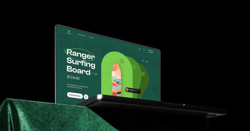
- Green: growth, health, peace → common in wellness, finance, and sustainability (e.g., Starbucks, WhatsApp, Mint).
- Yellow: optimism, happiness, warning → used in marketing and alerts (e.g., McDonald’s, Snapchat).
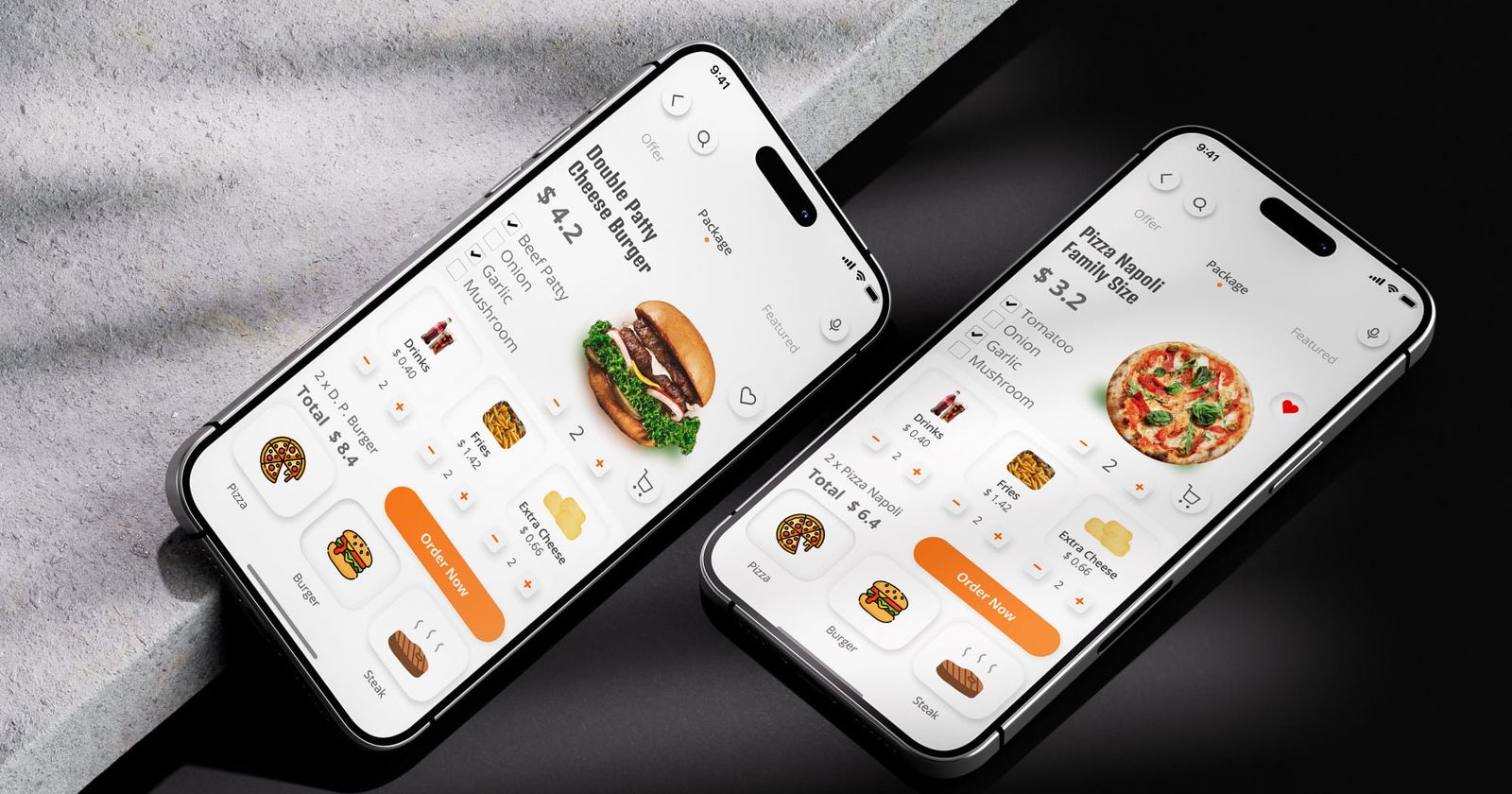
- Orange: creativity, enthusiasm, call to action → ideal for e-commerce (e.g., Amazon, Fanta, SoundCloud).
- Black: luxury, power, sophistication → used in high-end branding (e.g., Apple, Chanel, Nike).
- White: simplicity, minimalism, cleanliness → popular in healthcare, SaaS, and tech (e.g., Google, Tesla).
1.2 The role of warm & cool colors in UX
- Warm colors (red, orange, yellow): create excitement, urgency, and high energy.
- Cool colors (blue, green, purple): create calmness, trust, and professionalism.
- Neutral colors (gray, white, black): provide balance and sophistication.
Case study: Duolingo uses green to promote learning motivation, while Instagram’s gradient invokes warmth and engagement.
2. Modern Color Trends & Their Impact on UX
2.1 Trending UI color schemes
- Neubrutalism (bright contrasts & high saturation) → used by Spotify, Figma.
- Pastel & muted tones (soft & minimalist) → ideal for wellness, SaaS.
- Dark mode UI (black + neon highlights) → popular in fintech, dashboards.
- Gradient UI (color fusion & depth) → used by Instagram, Stripe.
- Cyberpunk neon (vivid, bold aesthetics) → popular in gaming, AI apps.
2.2 Cultural considerations in color usage
Color meanings vary by culture:
- Red in China = luck and celebration, while in the West = danger.
- White in the USA = purity, but in some Asian cultures it symbolizes mourning.
Tip: Research cultural color associations when designing global products.
3. Accessibility & Color Placement in UI
3.1 Accessibility & contrast guidelines
Follow WCAG 2.1 contrast ratios:
- Normal text: 4.5:1 contrast ratio.
- Large text: 3:1 contrast ratio.
Case study: Twitter/X switched from blue to black-and-white branding for higher contrast & modern appeal.
3.2 Psychological color placement in UI
- CTA buttons: use red, orange, or green to drive action.
- Backgrounds: light colors (white, pastel) improve readability.
- Navigation bars: dark colors provide structure and focus.
- Error messages: always use red for clarity.
- Success messages: use green to indicate confirmation.
Example: Amazon uses orange CTAs because orange boosts click-through rates (CTR).
4. Common Color Mistakes & How to Fix Them
Mistake 1: Using too many colors
Fix: Stick to a primary + secondary + accent color scheme.
Mistake 2: Low-contrast text & backgrounds
Fix: Ensure contrast ratios meet WCAG guidelines.
Mistake 3: Ignoring dark mode compatibility
Fix: Create adaptive color palettes for light & dark mode.
Mistake 4: Choosing colors based only on aesthetics
Fix: Use color psychology to drive UX decisions.
5. Real-World Color Psychology Case Studies
Case study 1: Facebook & blue branding
- Why blue? Blue fosters trust and reliability.
- Impact: increased user engagement and brand loyalty.
Case study 2: McDonald’s & the red/yellow CTA strategy
- Why red & yellow? Red triggers appetite, yellow boosts happiness.
- Impact: higher order volume and brand recognition.
Case study 3: Apple’s minimalist monochrome palette
- Why black, white, silver? A premium, sleek, futuristic feel.
- Impact: strong luxury appeal & brand loyalty.
Final Thoughts: Mastering Color Psychology in UI/UX
Color is a powerful UX tool that influences emotions, engagement, and conversion rates. Follow the best practices outlined here to enhance usability, create emotionally resonant designs, and improve accessibility.
Action steps:
- Select colors based on psychological impact & industry best practices.
- Optimize UI colors for accessibility & contrast compliance (WCAG).
- Use A/B testing to determine the best color choices for conversions.
- Keep up with modern color trends & responsive dark mode palettes.
Bookmark this guide for future reference and level up your UI color strategy!